How to Crop a Photograph for Composition based on Weight, Negative Space, Balance, and Storytelling.

The Image Will Always Tell You What To Do
Whether film or digital, the image itself will always have the information you need to make your cropping decision. As you get good at mastering the art of photography, creating, and composition, you will want to create this information and balance in advance.
You can control every element of composition in advance, which will provide the information you will need for correct cropping in post-production. The perfect balance and composition within the frame of your story will carry weight and importance in both a conscious and subconscious way.
More weight and/or emphasis of any element, one way or another, can make your image feel uncomfortable to view. There is a balancing act that is in every art piece. Understanding this balancing act is your responsibility as an artist. Yes, balances matter a great deal when creating.
Give equal effort and focus to understanding all aspects of the fundamentals of art will give your "style" equal and accurate representation within your artwork. There are few things more frustrating than seeing a wonderful photograph created by an obviously talented photographer that is cropped so poorly the artwork falls flat and falls apart. The life of this image will die without proper cropping.

Gestalt
A balanced and well-composed photograph is already on its way to being a great photograph.
Focus on proper balance and composition, and it can become the difference maker. Frame and balance each piece in your mind. Back away or size down each piece so you can see it as a whole. Try to see and feel the balance and weight of the image. Ask yourself questions. Is it easy to enter the image? Does the image hold your gaze? Can you read the story of the images easily? Do you feel comfortable when viewing the image...and by that I do not mean do you "like" the image. I mean, do you feel comfortable technically?
If you answer no to any of these things, you know something fundamental is off, and thus, the balance of the art is off within the frame of art you have created.
Start with Balance
Begin by applying compositional principles like the rule of thirds or the golden ratio to assess the current balance of the elements. Consider whether even distribution or purposeful imbalance would enhance the image's visual appeal.
Weigh Objects and Negative Space
Identify objects within the frame that carry significant visual weight and or balance. These objects could be characterized by vibrant colors, high contrast (light or dark spaces), or sharp focus. Simultaneously, take note of areas of negative space—those regions within the image that are less busy.
Placement for Balance and Emotion
Adjust the crop to achieve a balanced composition visually. If one side of the image feels weightier, leverage negative space or other compositional elements to restore equilibrium.
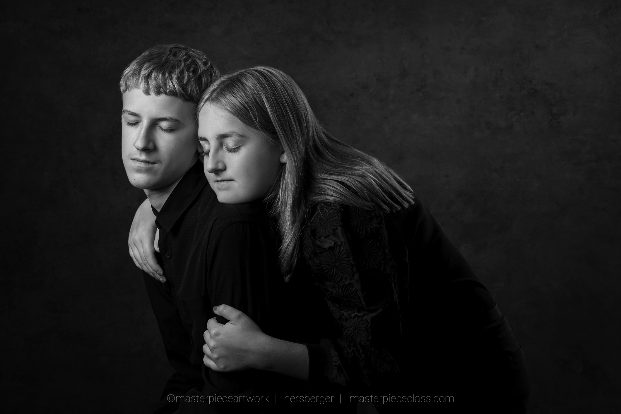
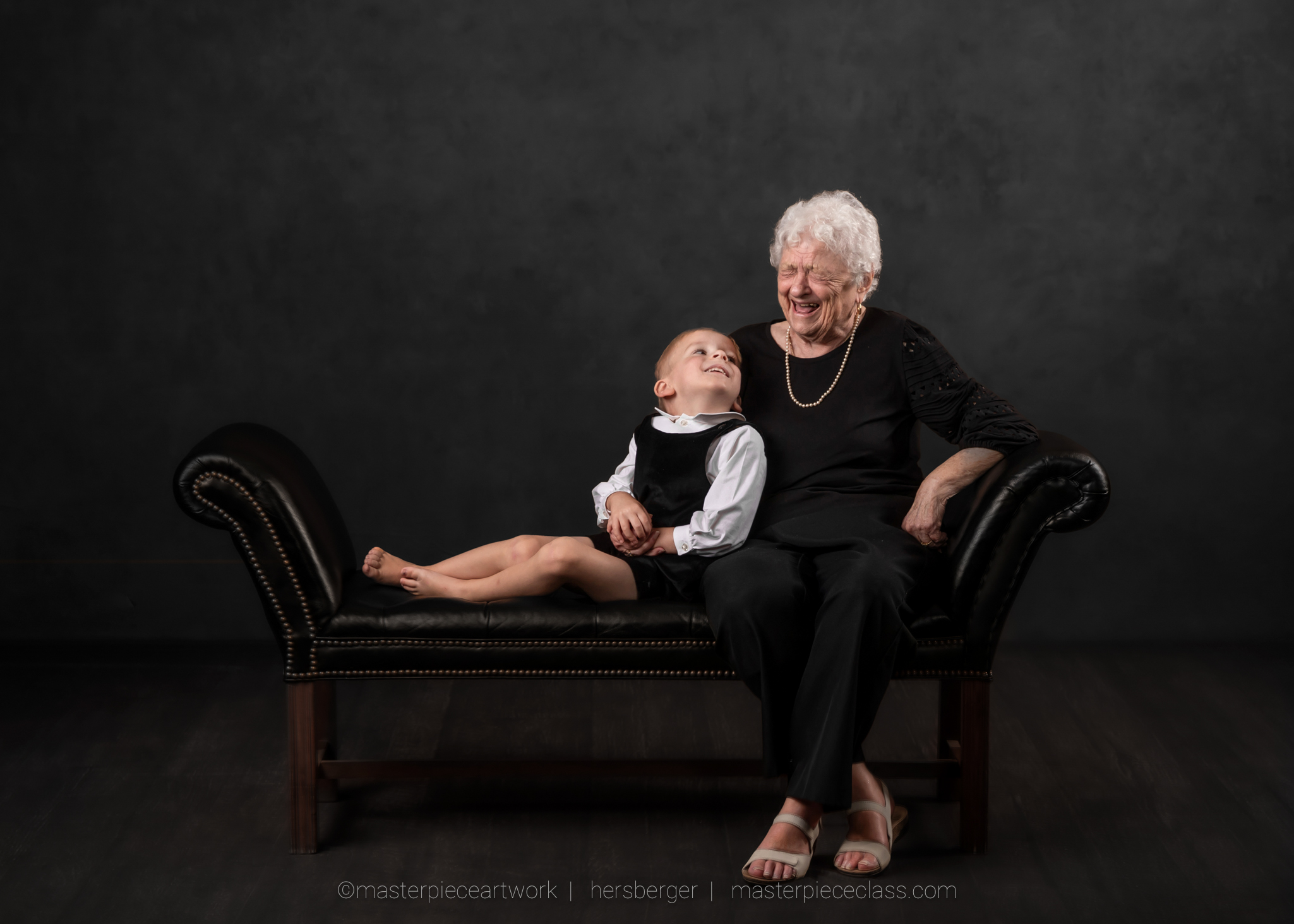
The use of negative space can be all-important to both balance and emotion within your artwork. As discussed a subject has a "weight" within the image and so does negative space. You may choose to use the two to balance the artwork and leave the subject in a very private position to the viewer.

Placement and Lighting
Composition starts with understanding placement and lighting. At the beginning of the creation of each masterpiece, there is only empty space or a blank canvas. This is the time to focus on designing your image for maximum impact and composition. A balanced piece starts by taking into account the fundamentals without excess overuse.
It is up to the photographer to place the subject or objects into this empty space with purpose and meaning. Correct execution at this stage of the creation will allow all other compositional elements and balance to find their place much more easily within the given space.
Lighting of the subject and a balance of light throughout the image will also help you read the image for the purpose of cropping. Have no doubt about the importance of light balance and the harmony it provides.
Photographers must also understand that proper lighting will help in reading the images and understanding how to crop a photograph for composition based on weight and balance.
Analyze the Photograph
Whether digital or film, thoroughly examine the image to understand its elements, emotional impact, and story. Identify the main subject, secondary subjects, objects, foreground, and background. Each of these people or things carry an important factor...weight. Ask yourself if it appears balanced.
Look closely to see if there are any distracting elements that could be removed via cropping. I prefer to have dealt with this in the camera prior to the images being created. Good photos require knowledge. Great photos require focused knowledge and thought put towards not only the characters in the images but also all other elements of composition.
An equal amount of knowledge of the fundamentals of art will help you balance your images. Character and object placement from the beginning will also show balance and make analyzing your images easier.
In every instance, each element, character, or object in your image has a purpose and meaning. There is a balancing act at play, and you must pay particular attention to the weight they will present. Each will affect your decisions on cropping and aspect ratios.

Horizontal or vertical?
One of the first things you must consider when photographing is whether the final piece will be created with a horizontal or vertical presence. You must see and plan for this in advance, or cropping and balances will become difficult within the scene or story you create.
Choose the Right Tool
Choose a photo editing tool that provides cropping functionality along with other relevant editing features. Depending on your skill level and preference, this could range from professional software like Adobe Photoshop to user-friendly apps like Lightroom or Camera Raw.
Personally, I prefer Lightroom, as I feel there is not a better cropping and foundational preparation tool on the market. It will help you create maximum impact with ease and be a cutting-edge difference-maker for your photography.
Aspect Ratio
Various things become much easier and more impactful; however, the cropping tool gives you the ability to crop in many accurate ways. You can also set aspect ratio options that allow you to create specifically for these ratios in advance of post-production.
A good example would be setting a ratio that is 5"x7". You may have chosen products that consistently require that ratio, such as Christmas or greeting cards or wall art that, when upsized, are the same ratio. An example of that 5"x7" ratio would be a canvas that is 20"x28" or 40"x56". That ratio may also fit well within the books you make.
The ratio stays the same as your scale; however, the size of the photograph does not remain equal. With this ratio fitting multiple products, you can then choose to set up for this ratio in advance. This makes cropping and balance much easier to attain with consistency.
Select an aspect ratio that complements your desired composition. The aspect ratio choice can significantly influence the visual dynamics, harmony, and emotional impact of the photograph.
Emphasize the Subject
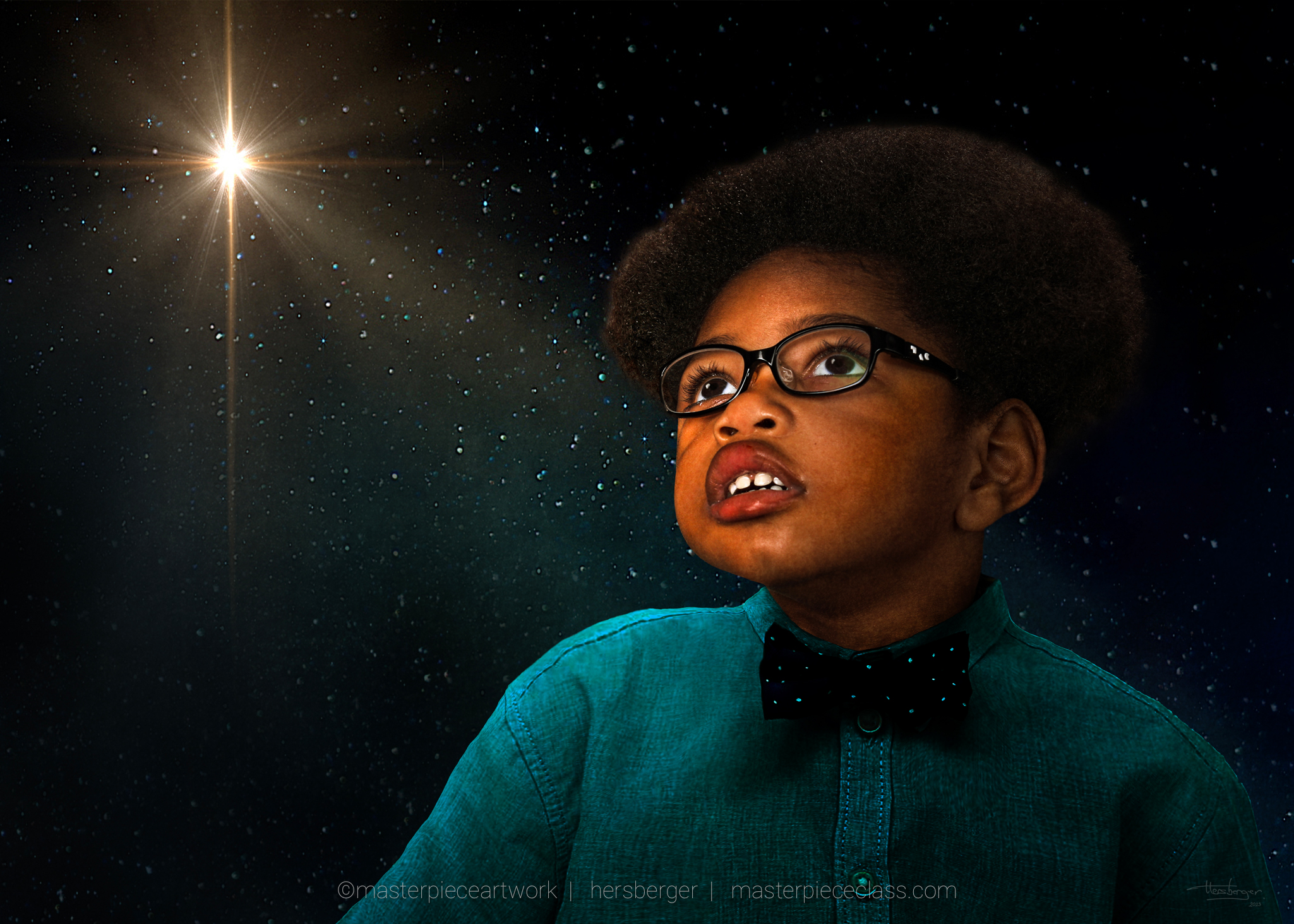
Strategically position the main subject based on compositional principles. Placing the subject near intersections of the rule of thirds grid or other points of interest draws the viewer's attention to exactly where you want their eye to go.
Negative Space
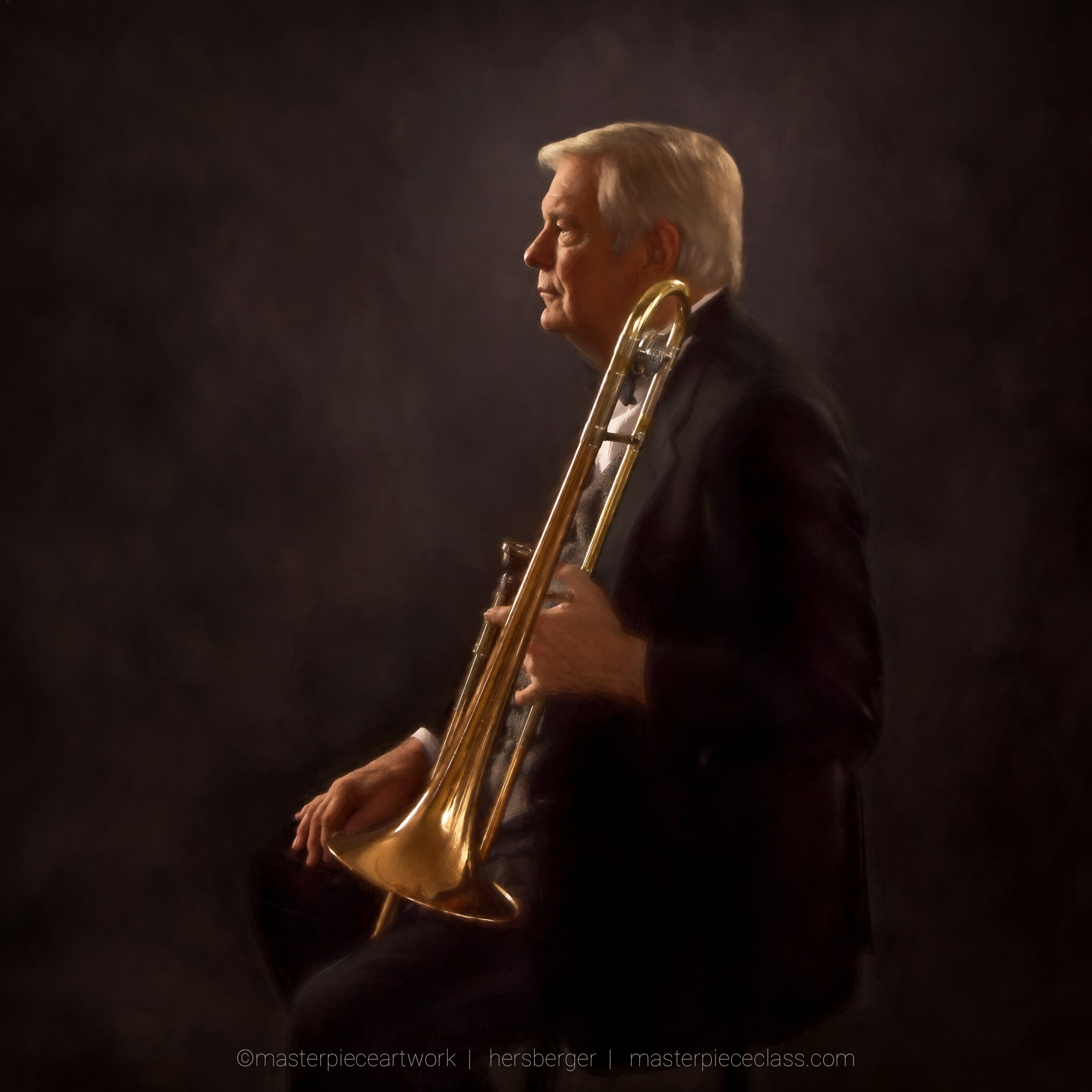
Leverage negative space to underscore the subject's importance. Negative space always plays a part in a photo. Use this space wisely. Think of how the director on a film set may give a sense of suspense by using the negative space in a way that creates a dramatic effect and or privacy.
Explore how negative space contributes to the mood and storytelling within the photograph. Utilize negative space to highlight the subject, establish a sense of isolation, or provide contextual information. Tailor the crop to incorporate an appropriate amount of negative space for your intended impact.

Consider Leading Lines and Direction
Evaluate any leading lines or directional elements present in the photo. Adjust the crop to enhance their prominence, thereby guiding the viewer's gaze toward the subject or through the negative space.
Do not crop out great leading lines, as they can be the eye's entry point into the images and also the lines that lead the viewer to read your storyline.
Identify objects or details that enrich a balanced storyline within the photograph. These elements could provide context or convey a narrative theme. Thoughtfully position these elements within the frame to enhance the overall storytelling experience.
Understand the difference between "supportive" elements and elements that are key parts of the photo. Determine the outer edge of each element within the photograph and ask if they are in balance. They look at the best ratio or mathematical equation that allows you to crop the frame with breathing room.
Breathing Room and Grounding Your Image
Breathing Room
When any subject "or story" is cropped too tight, the viewer is left feeling uncomfortable or claustrophobic. They never get a chance to rest their eyes on your desired storyline, for they leave the images due to this uncomfortable feeling.
Find the outer edge of each of the main or supporting elements (they should already be in balance) and move out from that point...but how much? That is where "grounding your artwork" comes to play.
Grounding Your Artwork
A general rule of thumb when cropping is to have less space on the bottom (but still some breathing room), then double that space on each side (from the outermost subject or usually supporting item to the story), then double that amount on the top of the crop.
Not only does this provide a wonderful and "comfortable breathing space for the viewer, it also provides a solid balance and structure for the art to sit comfortably for the life of the art.
Although this is not a rule that is cast in stone for all images (some extremely symmetrical images will have the same exact breathing space around the entire subject), for the most part, this rule is pretty accurate.
Experiment and Compare
Create several versions of the cropped artwork, each exploring different compositional possibilities. Compare these versions to determine which one best aligns with your artistic vision for weight, balance, negative space, and storytelling.
After selecting the preferred crop, employ editing tools to fine-tune the image's qualities, such as exposure, contrast, color balance, and more. These adjustments enhance the overall quality and coherence of the composition.
Preserve the final cropped photo as a separate file, ensuring that both the original and any alternate versions remain accessible for future reference and exploration.
Exceptions to Every Rule
While these steps offer a structured approach, photography is an art form that involves a blend of technical understanding and creative intuition. As you practice and refine your cropping skills, you'll develop a deeper appreciation for how elements like weight, balance, negative space, and storytelling interact to produce compelling compositions.
